|
Project:
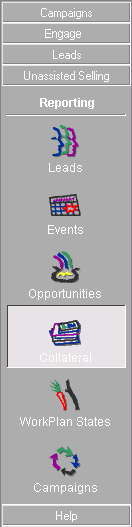
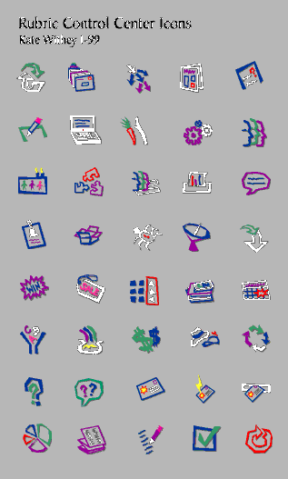
UI & icon set Other info: EMA has a large number of different sections. Many are dynamically linked, so the navigation is automatic, but we designed the Control Center (which appears on the left side of each EMA window) as an explicit way to reach all of them. The sections are divided into categories; each category has a labeled button that opens out into a group of icon buttons. The graphic style for the buttons evolved from the icons I designed in 10 minutes on the first day to have something -- anythng! -- instead of the programmer's clip-art buttons. It turned out that everyone really liked the casual style, & the bold graphics particularly appealed to the marketing people who were the product's target market. This is an example of the Control Center, & a batch of the icons that go into it. |
![]()
| home | philosophy | portfolio | résumé | destination | quotes | back | talk to me! |